GOAL
ROLE & SKILLS
Design a more user-friendly and intuitive LMS application than the current LMS which is
provided by a SaaS company.
Timeline: September 2019 - Jan 2020
UI/UX Designer
User Research, UI/UX Design, Prototyping, Interaction Design,
User Testing
Project Summary
Applied Learning Management System (LMS) is my first project at Applied Medical. I worked on this project
together with another UX Designer, Imran Makki. The main goal of this project is to
provide a more tailored application that suits the needs of the learning team and makes learning easier for team members.
The problem with the current application is that it's not very intuitive and there are many obstacles to completing
just one training.This project was divided into 2 phases. The first phase covers only one section which is the Quality
Document. This is the most important section on Applied Learning where team members would come to complete their assigned quality
documents before the deadline. The second phase covers the rest 9 sections (Training, Catalog, Course Assignment, Course
Management, ILT, Curriculum Creation, Admin Creation, and Test Engine). In this case study, we will focus on the first phase
that covers only Quality Document.
Project Constraints
- The tight timeline for the project limits the design and development to focus on the MVP.
- Some features have to be cut in the first phase to meet deadlines.
- Thinking ahead of how the Quality Document section will work with the rest of the features
in Phase 2. Solving the problem holistically by keeping in mind the other upcoming features and
different views for various user types.
Research
Before we started designing, we did a competitive analysis between the current
application and other existing learning management systems in the market (Coursera, Udemy, etc.).
From there, we listed a couple of pain points of the current LMS and listed out features that we find
as potentially useful for our users. We run through this list together with the learning team, explaining
our reasoning and giving a couple of scenarios where we think the proposed features will be helpful for
the users.
Pain Points
Some of the pain points on the current learning management system:
- Too many clicks are required to complete an SOP (Standard Operating Procedure). There are
around 5 clicks to mark an SOP as Completed.
- SOP document PDF needs to be downloaded (Team members can't view it online). This adds an extra
step to view the material itself.
- There's no ability to check if a training PDF has been read by team members. Once the PDF has
been downloaded, the option to mark that training as completed will be visible right away. This
loophole raises concern that team members might not review the material.
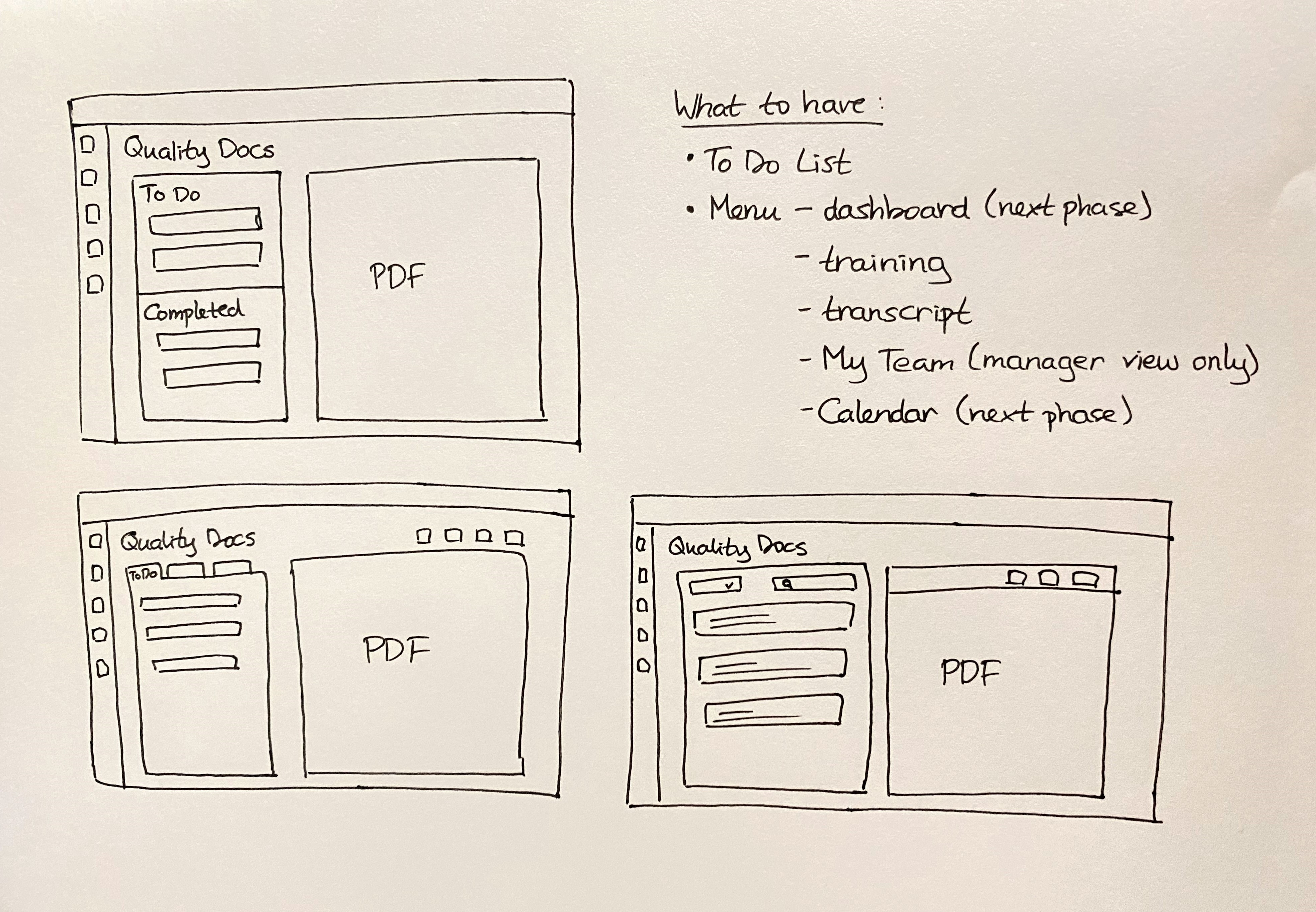
Sketches
While doing competitive analysis, I also noted
a couple of things that are nice to have and sketched a couple of layouts for the Quality Docs section.
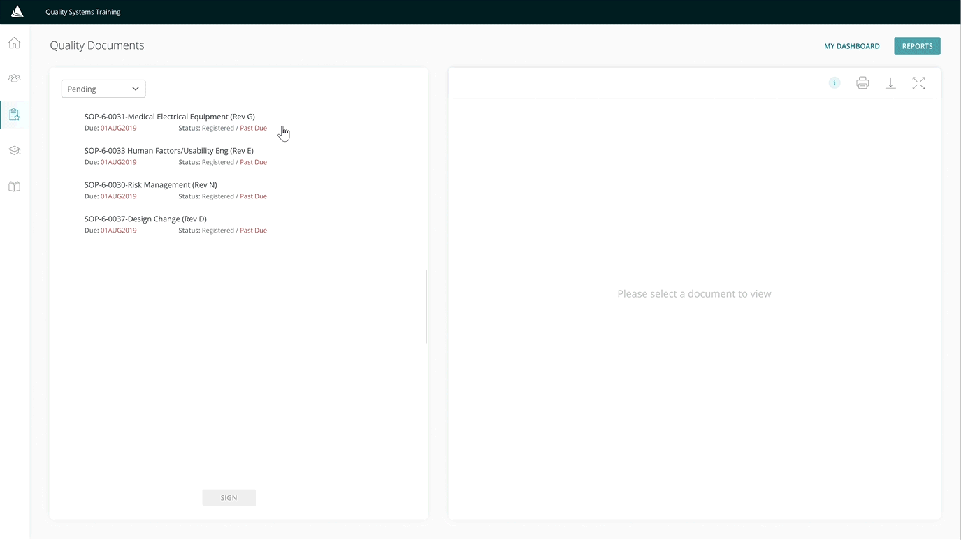
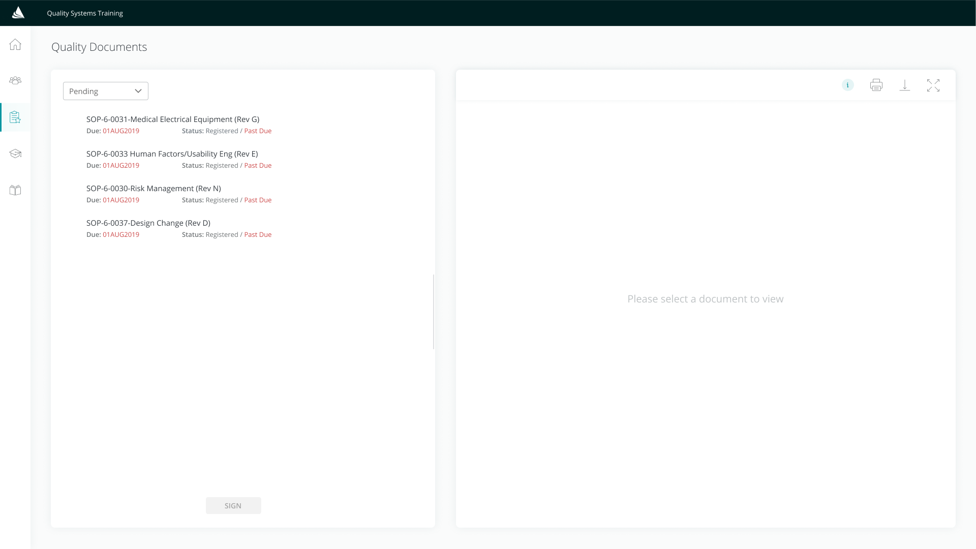
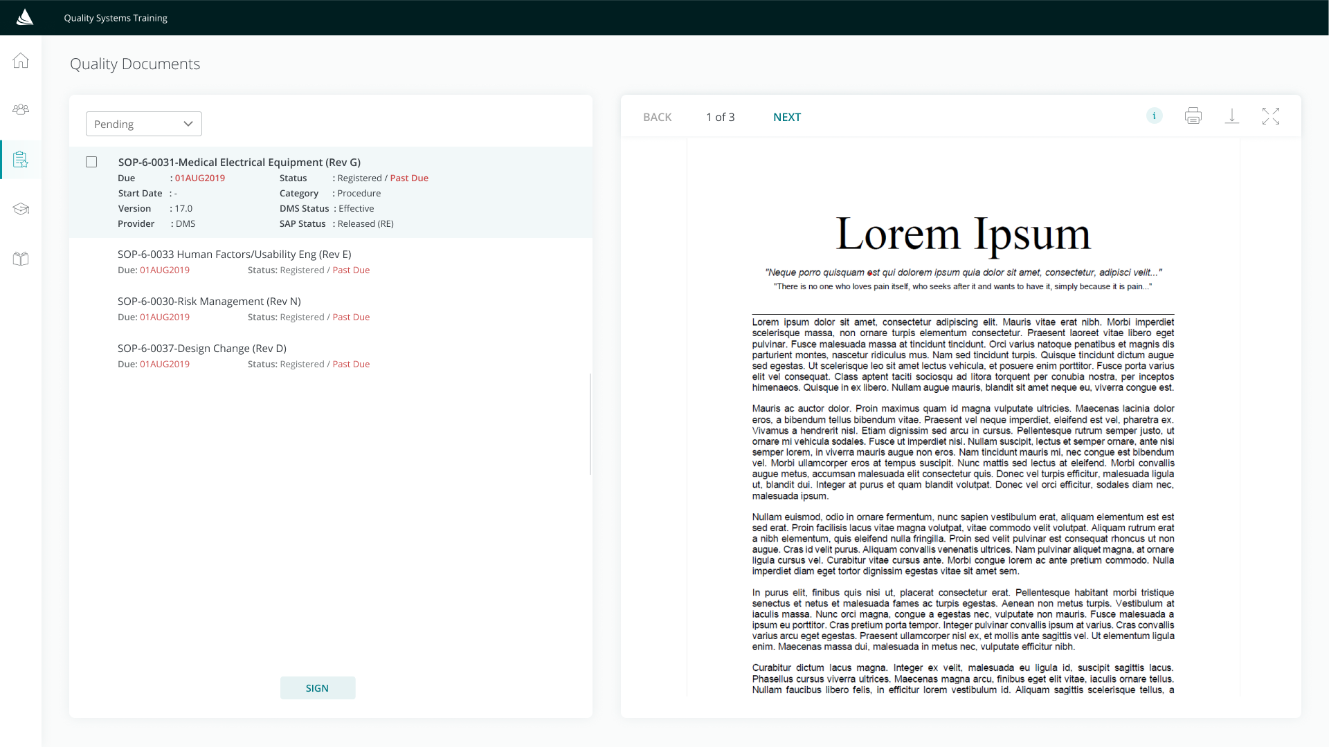
After exploring a couple of page layouts, we decided on using a two-card system. This solution solves our main
objective which is to cut down training completion time.
A couple of advantages from this two-card system:
- Team members can preview and see the length of the document. This feature will help them decide whether they
have the time to complete that document at that moment.
- Team members have two options to view their documents. They can either view the material on the two-card
preview mode (the PDF text size is still legible to read) or on the full-screen view mode.
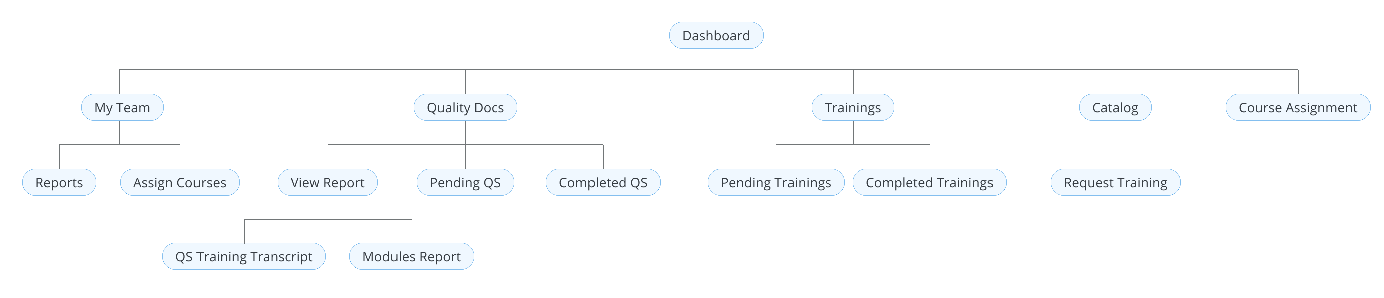
Below is the sitemap of Applied Learning that applies to individual contributor team
members and managers. I exclude the sections that are only available for admins from the sitemap below to
keep it simple as we'll only be covering a small part of the project in this case study (Quality Docs - Phase 1).
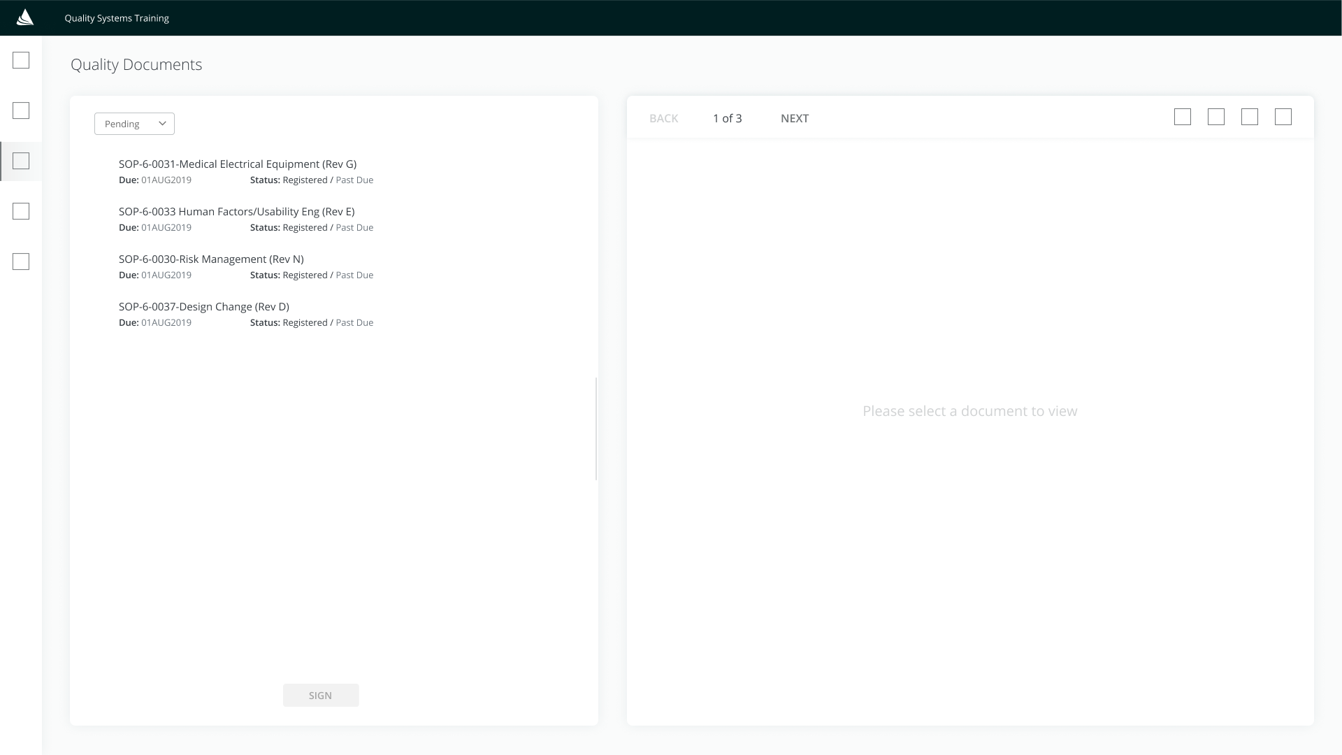
Wireframes
While keeping in mind the main goal of this project — reducing the number of steps to
reduce the time of completion — I mocked up a couple of wireframes to gather initial feedback from the learning
team and Engineers for feasibility.
Style Guide
Around the same time, I also got the opportunity to create a design system for the
UI/UX team—our team is pretty new hence there's no existing design system. I compiled styles across other
released projects, sorted them out, and created one concise style that the team could use. (More information
on design system project - coming soon)
Collecting Feedback
For a month before its launch, we made Applied Learning visible only to a couple of
selected team members from different departments and positions. The goal is to get feedback from users with
different backgrounds (various age groups and levels of tech-savviness).
Based on these test users, there are no concerning problems encountered.
The only change we made was moving the description of SOPs to a modal instead of including it as part of the card.
The reason for this change is because we found out that team members don't usually pay attention to this extra information
since it's not relevant for them — the description is beneficial only for the admins.
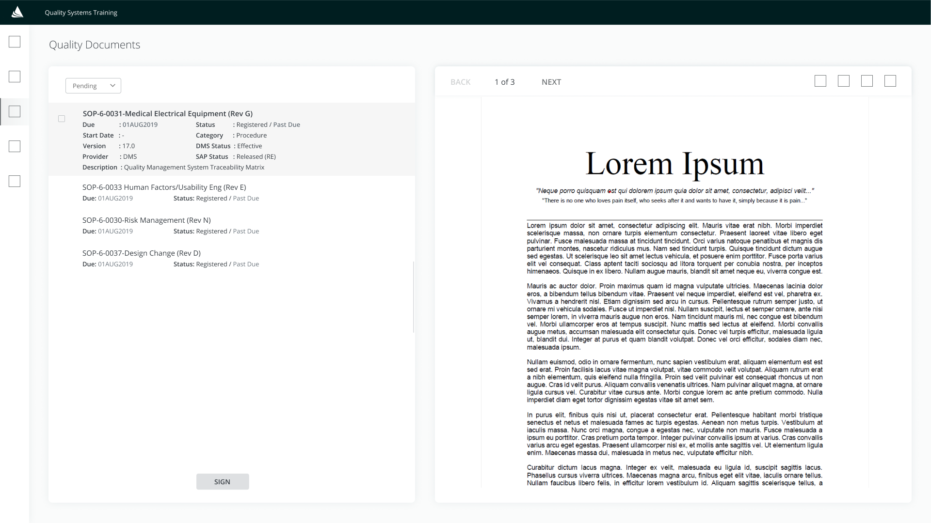
Mockups
After collecting user feedback, we made updates on the Figma mockup screens and share the changes
with engineers. We worked closely with the Front-end team to ensure everything aligned with the designs before the launch.
The mockup screens below are the final design after addressing the user feedback and a couple of new requirements requested
by the learning team.
Some of the changes are:
- Removed Description on the card details and placed it as an info button on the right card.
- Added the My Dashboard button on the top right corner. This was a new requirement, which allows team members to access
their transcripts on a temporary dashboard page. (Note: Dashboard needs to be pushed back for future updates due to time limitations.)
- Added the Reports button on the top right corner — only visible for managers. Clicking on this button will open the Power BI
window where managers can view their team's transcript.
Results and Takeaways
We are so proud to finish Phase 1 of this project on time. Since the launch in January 2020, we have
been receiving lots of positive feedback about how it's more user-friendly and efficient compared to the old LMS. With
the new LMS, we managed to cut down the time spent by team members in completing their training. From 5 clicks to 3
clicks — 40% time reduction for task completion.