GOAL
ROLE & SKILLS
Design a self-service shampoo refill kiosk that addresses the convenience of automation
and also helps solve the problem of plastic pollution.
Timeline: April 2019 - June 2019
Product Designer
Product Design, Research, UI/UX Design, Prototyping,
Interaction Design, User Testing
Project Summary
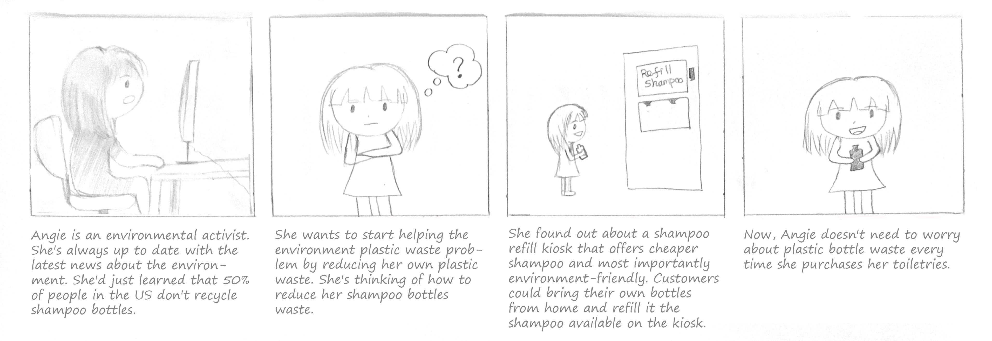
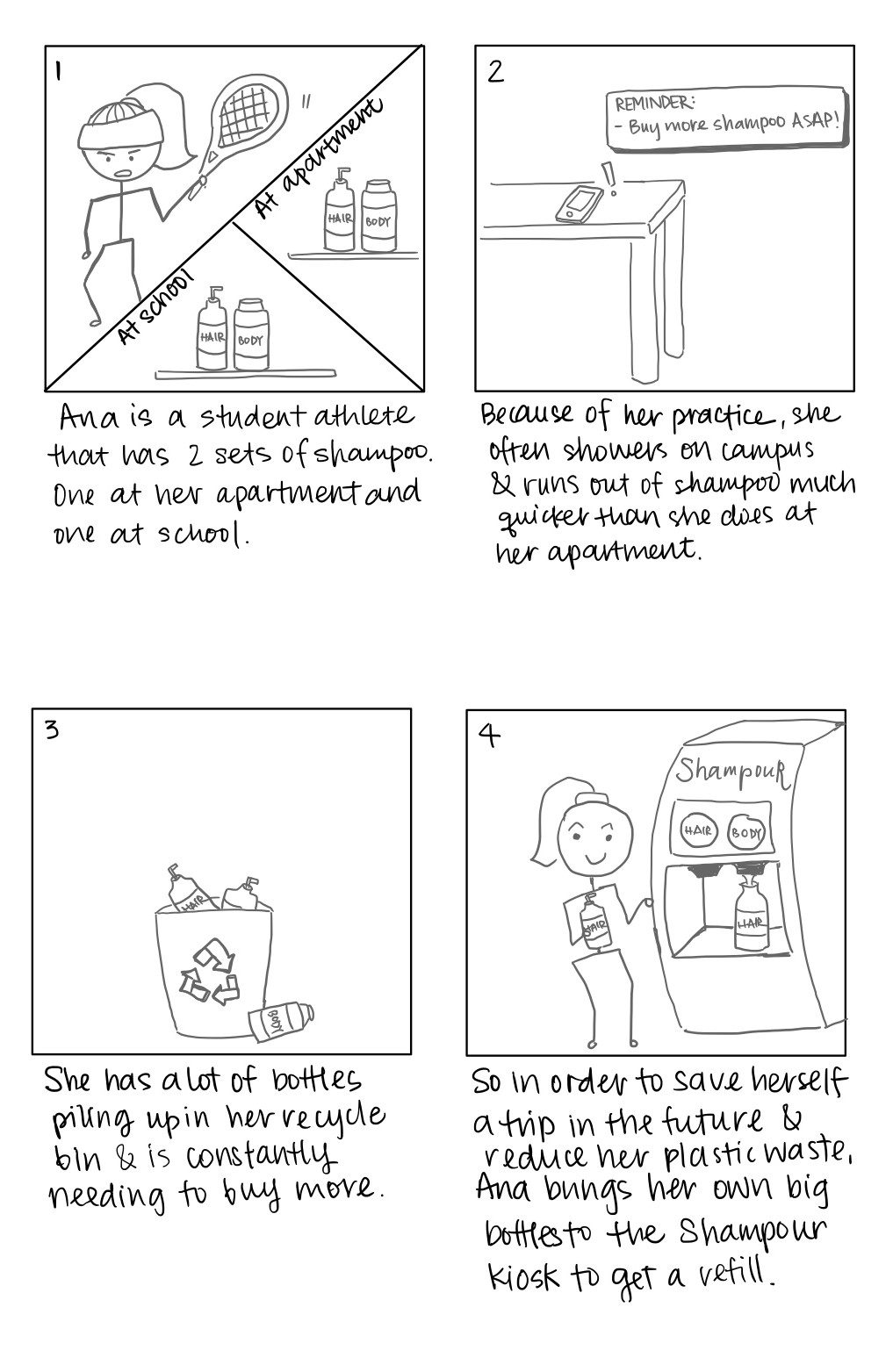
This project aims to design an interactive kiosk that leverages physical interaction with users
and objects to create an experience that is intuitive, consistent, and reliable. Our team chooses a context where people
currently need to wait in line to see a human service provider and try to improve that experience to be automated. My
team decided to delve into the context of the retail setting. More specifically, a self-service shampoo refill kiosk that
addresses the convenience of automation and also helps solve the problem of plastic pollution.
Research
First, we researched online to learn more about plastic pollution issues and consumers' related habits. We analyzed
a couple of refill kiosks currently available on the market to examine the current limitations and frustrations that
customers encounter. From our online research, we found a couple of facts that help us decide on the overall kiosk experience
we want to achieve:
- More than 552 million shampoo bottles could end up in landfills yearly — equals 1,164 football fields.
- 50% of people in the US don't recycle shampoo bottles.
- Shampoo bottles are one of the plastic waste with high-density polyethylene type (HDPE) — non-biodegradable
and can take centuries to decompose.
- Some companies have started to make shampoo bottles from ocean waste.
- There are a few existing refill kiosks — one of them is EcoPod. However, they only sell their brand product.
Observational Findings
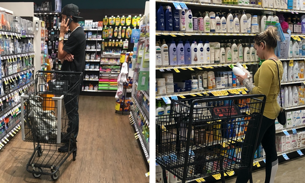
To better understand people's shampoo buying habits, we went to do observations at a couple of grocery stores (i.e., Vons and Ralphs).
- Some bought products for their family or significant other. We saw that a couple of people were on their phones talking
with someone else to get more details on which product they should buy.
- People spend about a few minutes (around ~5 minutes) while choosing toiletries, even if they already know which product they want.
- A couple of people walked back and forth along the aisle to get a scope of the choices. After that, they would compare a
couple of the available options.
- Some people have a particular brand they want to buy. Meanwhile, some browse across brands and scents.
Interviews
Since the data we gathered from observations are our interpretation based on what we saw people doing,
we wanted to confirm by interviewing a couple of people. So we came up with a list of questions and returned to the grocery
stores a week after the observation to find a few shoppers in the shampoo alley for a short interview.
Below are a couple of our findings:
- Most shoppers consider price when choosing a product.
- 50% of our interviewees recycle their bottles.
- Open to trying new brands or scents. However, most of the time would stick with their preferred brands.
- Most shoppers purchase toiletries for themselves.
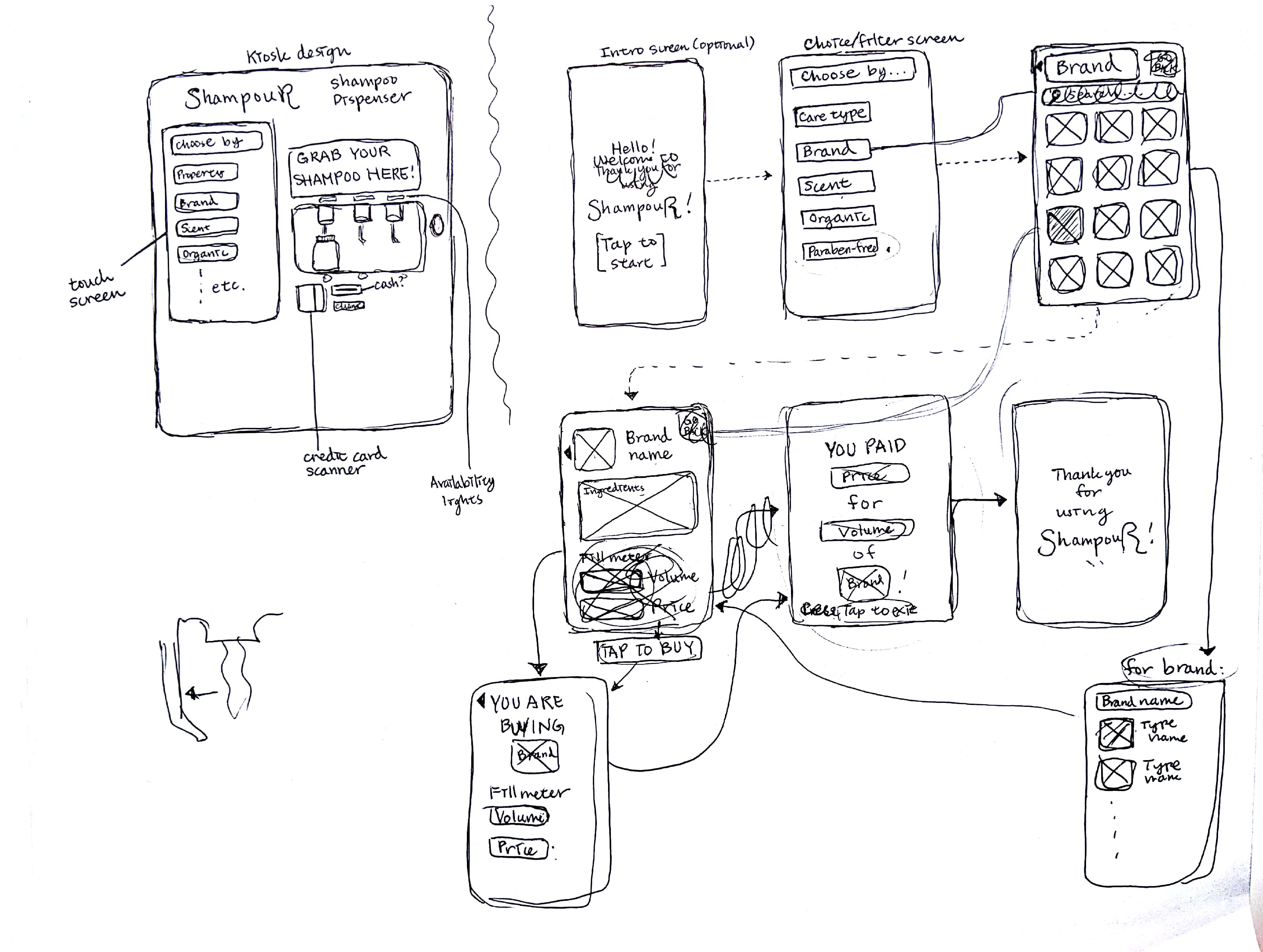
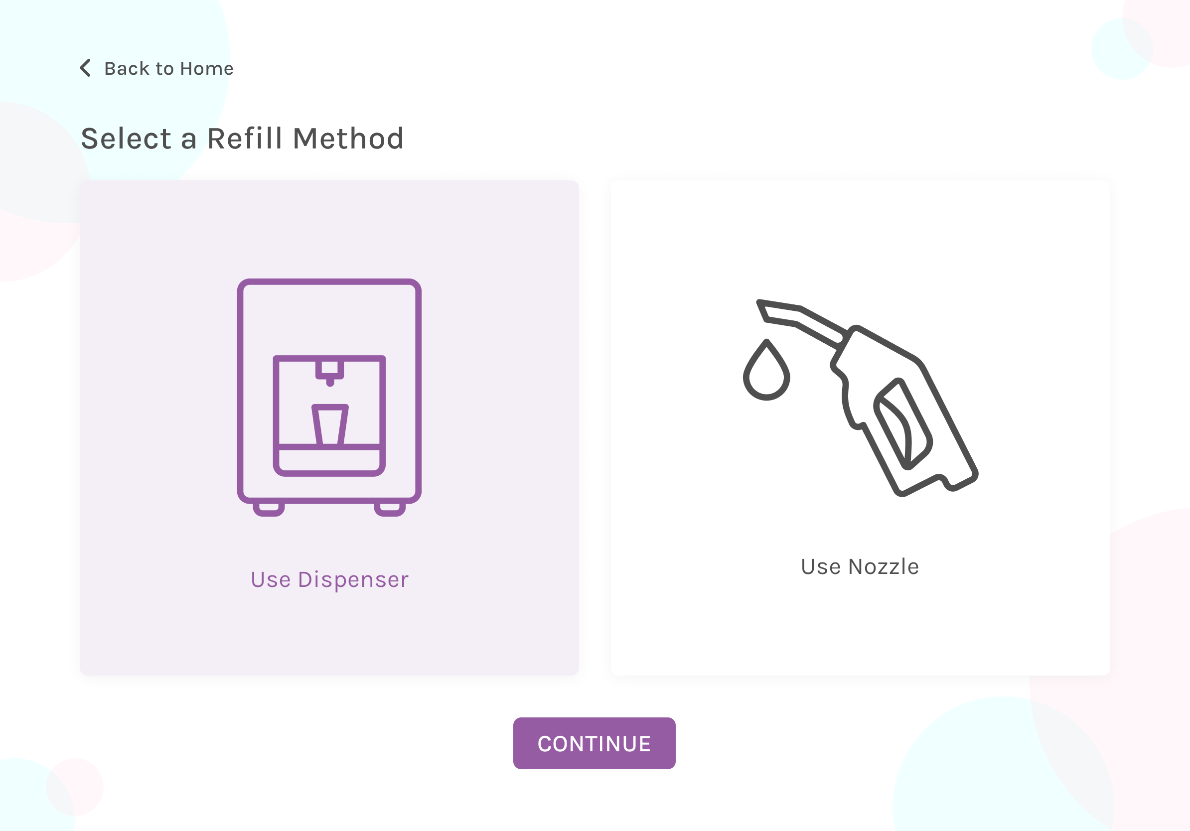
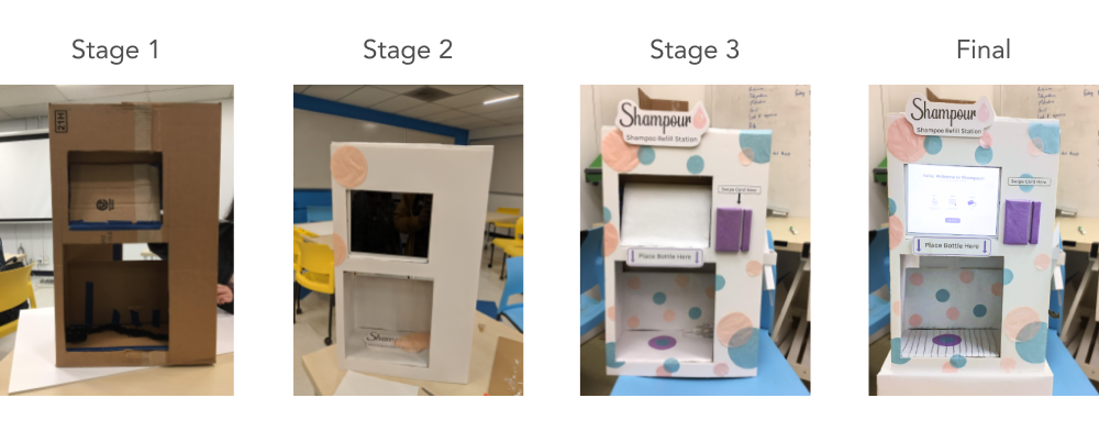
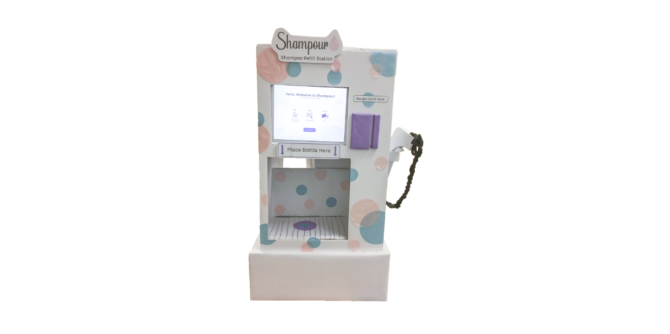
Kiosk Prototype
The kiosk prototype went through 4 stages of implementation in total. We added minor details along the way
to make it look as close to a real-life kiosk.
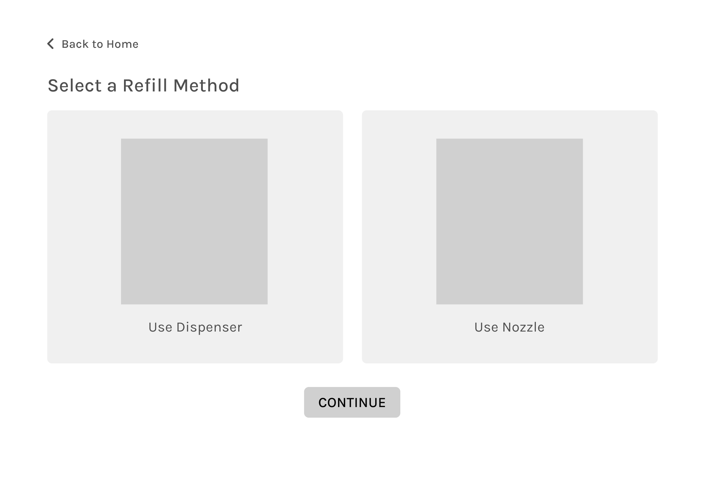
- On the right side of the iPad slot, we created a credit card swiper made from cardboards.
- The bottom nook is where the dispenser is located. It's where the customers are supposed to put the bottle to get their refill.
- On the right side of the kiosk is the nozzle that serves as an alternative way to fill up the bottles. We think this will be a
convenient alternative to refill, especially if the bottle brought by customers doesn't fit the bottom nook.
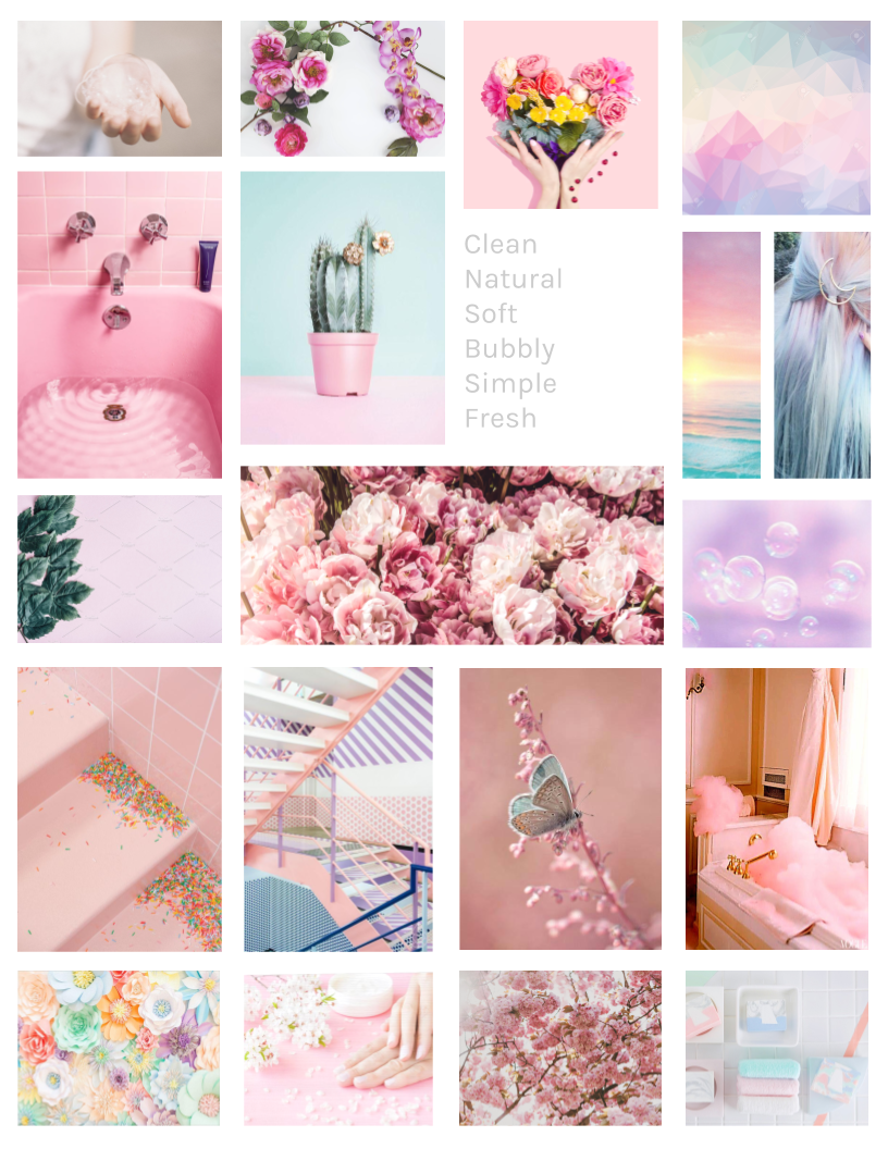
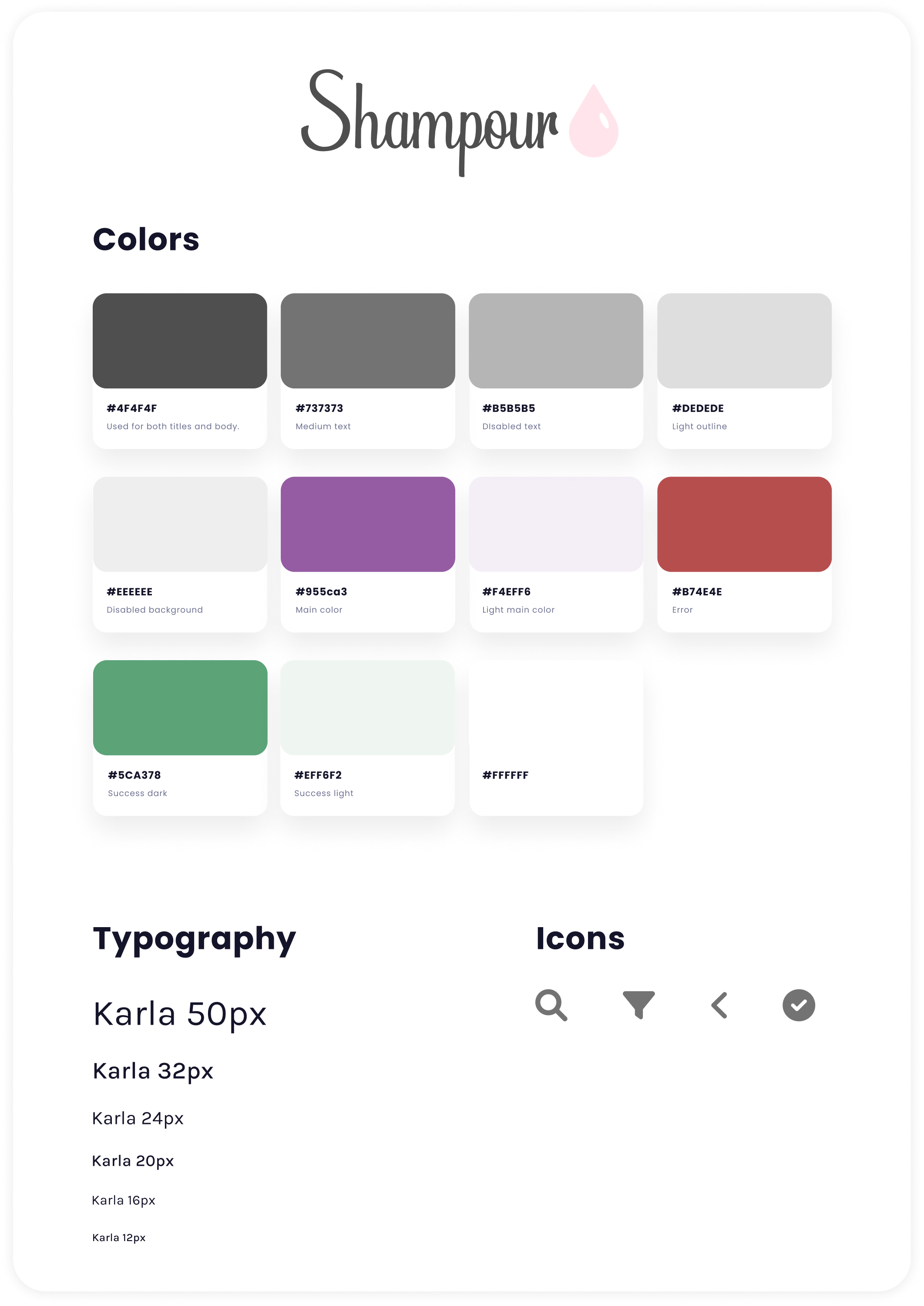
Style Guide
Referring to the theme we created on our mood board, we used pastel pink, blue, and purple as our color
selection. For the font, we chose to use Karla, which fits our theme perfectly — simple and bubbly. On the top is the logo that
we created using Adobe Illustrator. The font used on our logo is also Karla, with a soft pink shampoo droplet on the right side.
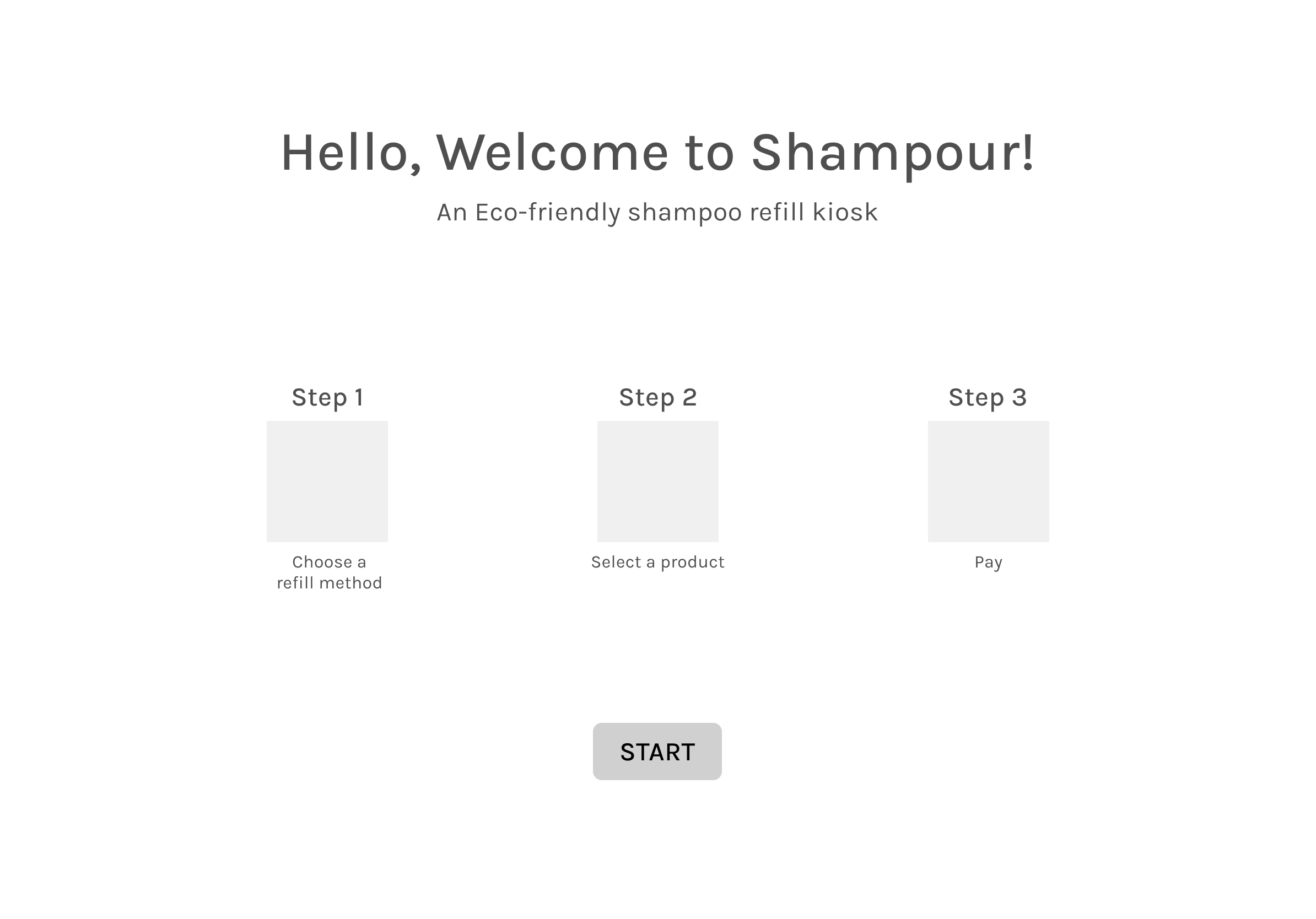
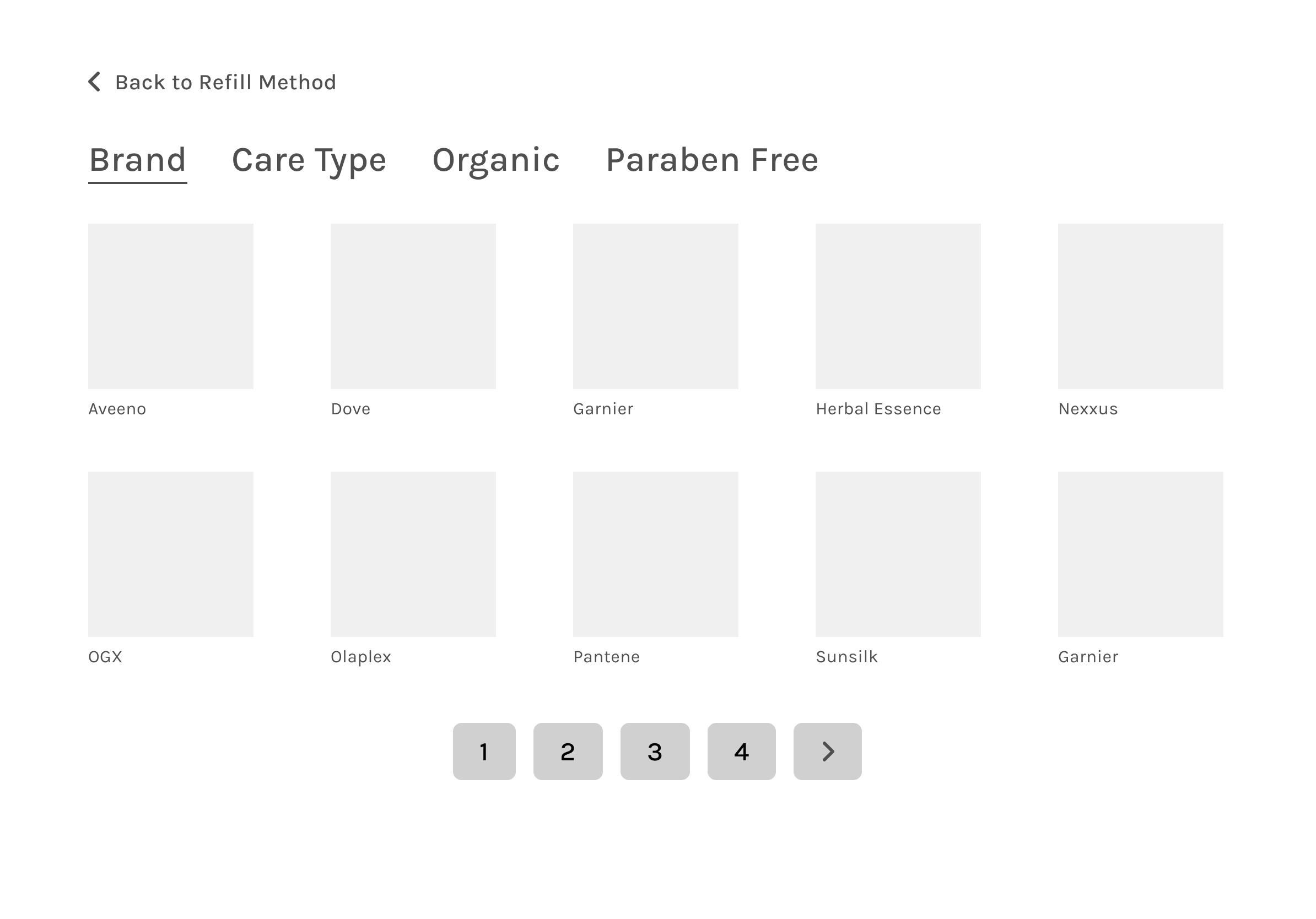
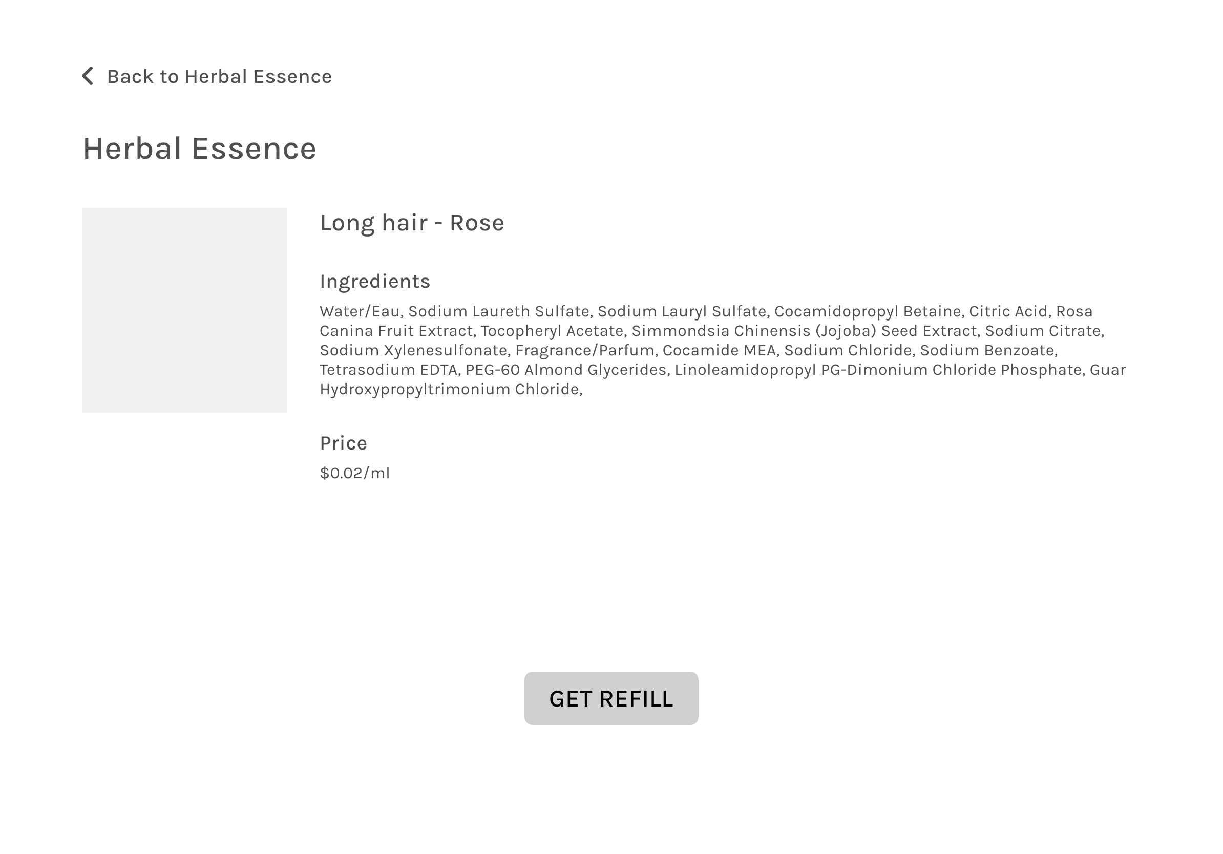
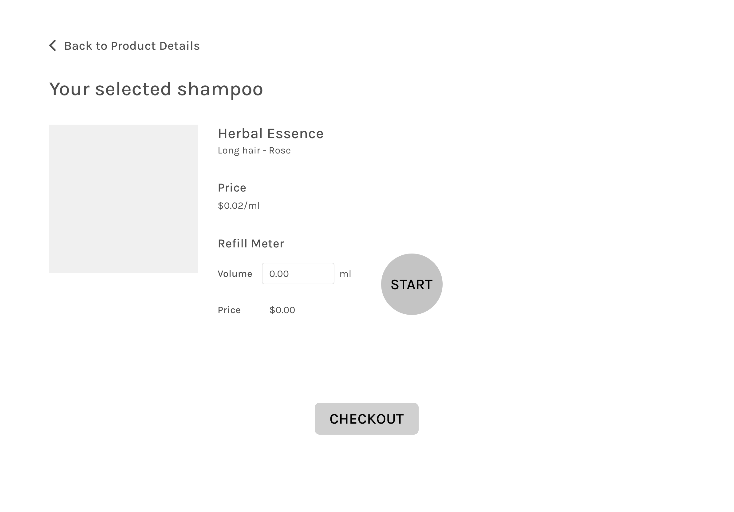
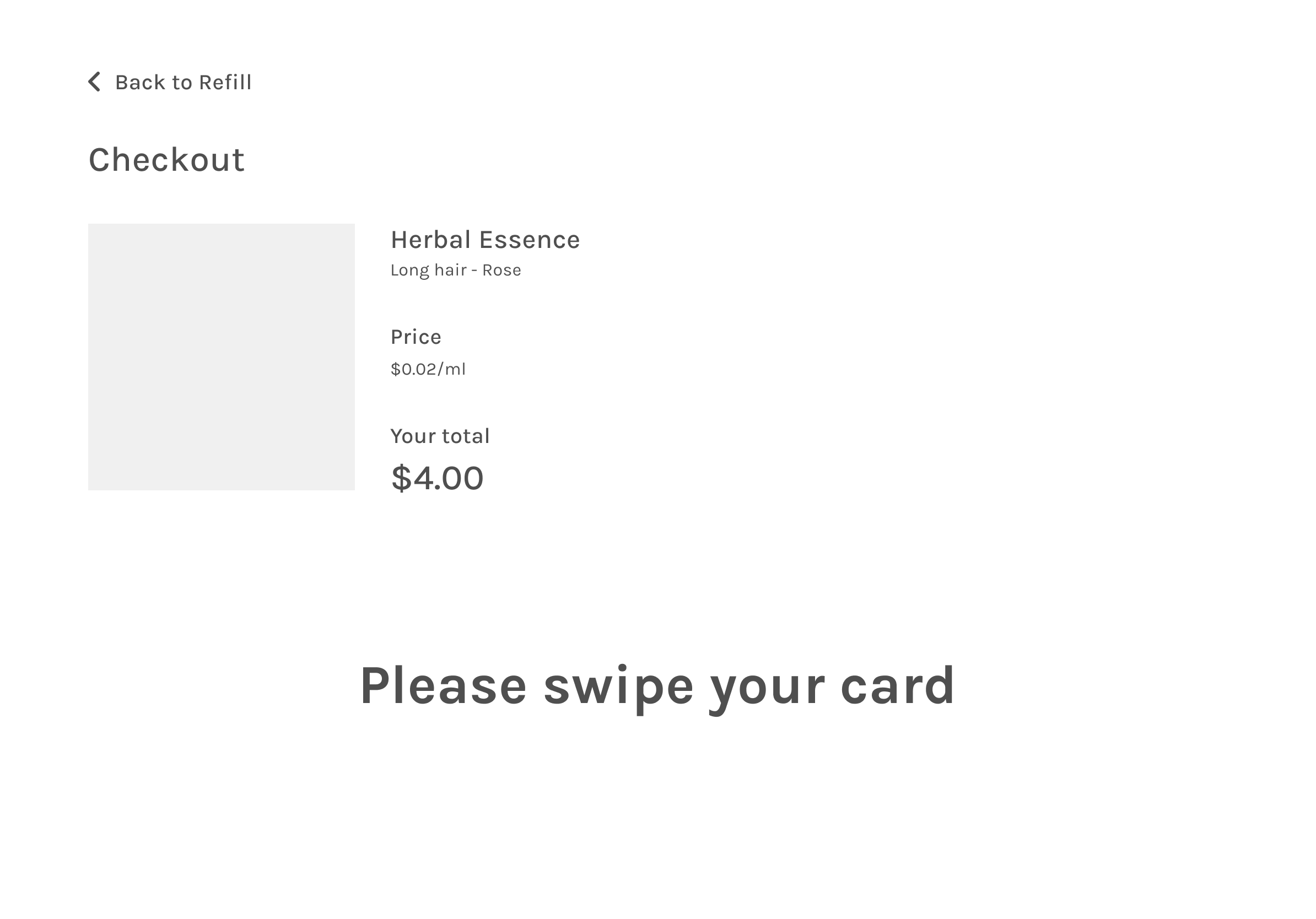
Wireframes
Below are a couple of the main wireframe screens. You can view the whole flow of the wireframes
here.
Usability Test
In general, users found the Shampour kiosk intuitive and easy to use. There were a couple of issues that
need to be addressed in our next iteration. We also added a couple of extra steps to make the experience smoother. Below are the
feedbacks and problems that we have found during testing.
User testing 1:
- Some users were unsure when to place a bottle under the dispenser. To solve this problem, we added a pop-up informing
users to place their bottles under the nook after making a selection.
- Users want the ability to set desired refill volumes for a more effortless experience.
User testing 2:
- Suggest adding grating or something simulating it to show that it wouldn't be an issue if there were to have any spillage.
- Some users suggested adding a scent option to our filter options. However, considering that different brands might have
different formats of scent names — which doesn't always reflect the ingredients — it would be hard to make scent as a
category. For this reason, we didn't add a filter based on scents.
- Some users who chose the nozzle refill method found the 'Fill in your bottle with the nozzle on the right' pop-up confusing.
We expected them to click the continue button on the pop-up, but some users only wait for the product to be dispensed after
taking the nozzle without clicking the continue button. So we changed the wording to "Pick up the nozzle on the right,"
removed the continue button, and added a timer so the pop-up would disappear after 3 seconds. Then the customer could start
filling their bottle.
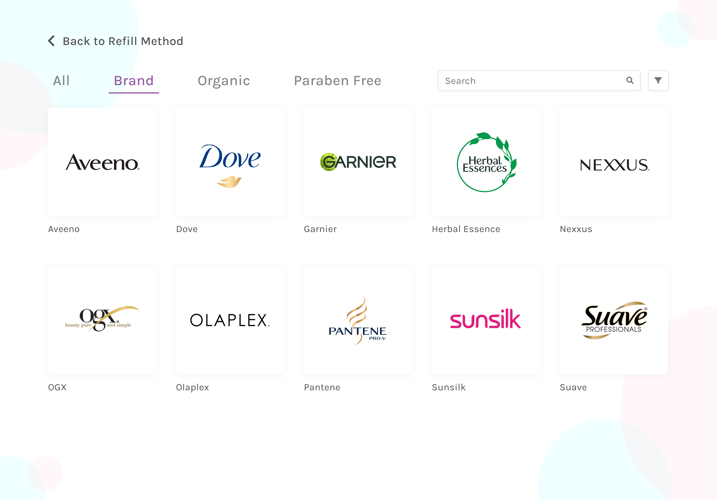
- Some users wish to have a search bar. This functionality will help people that already have a specific product in mind.
- Some users want a price filter to satisfy their desire to compare product prices. We then added the functionality to filter
products by price range on the next iteration.
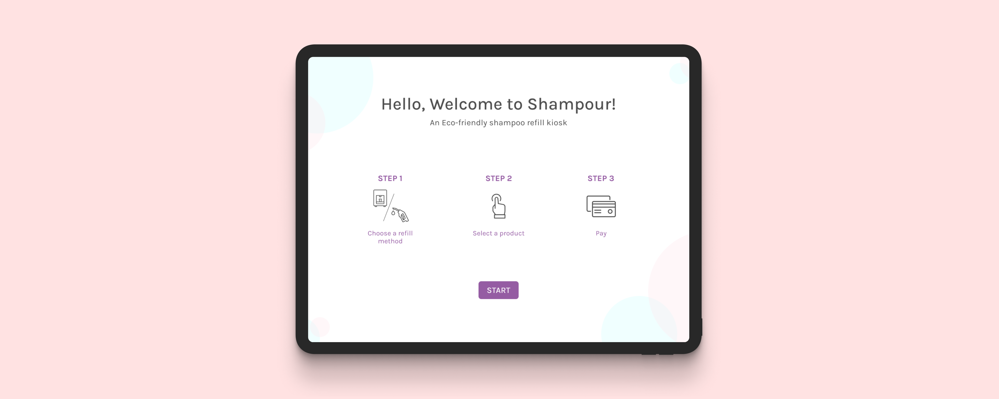
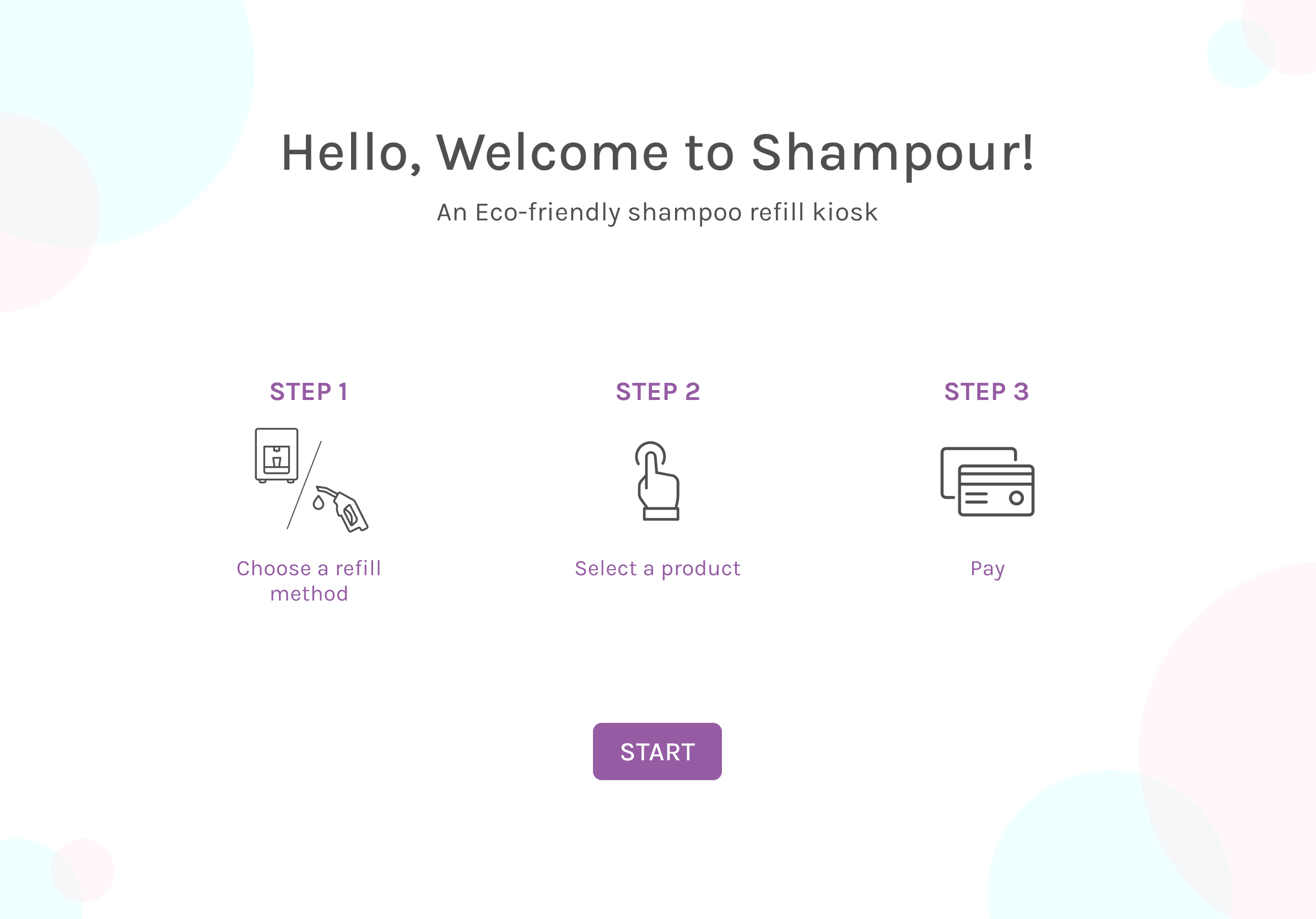
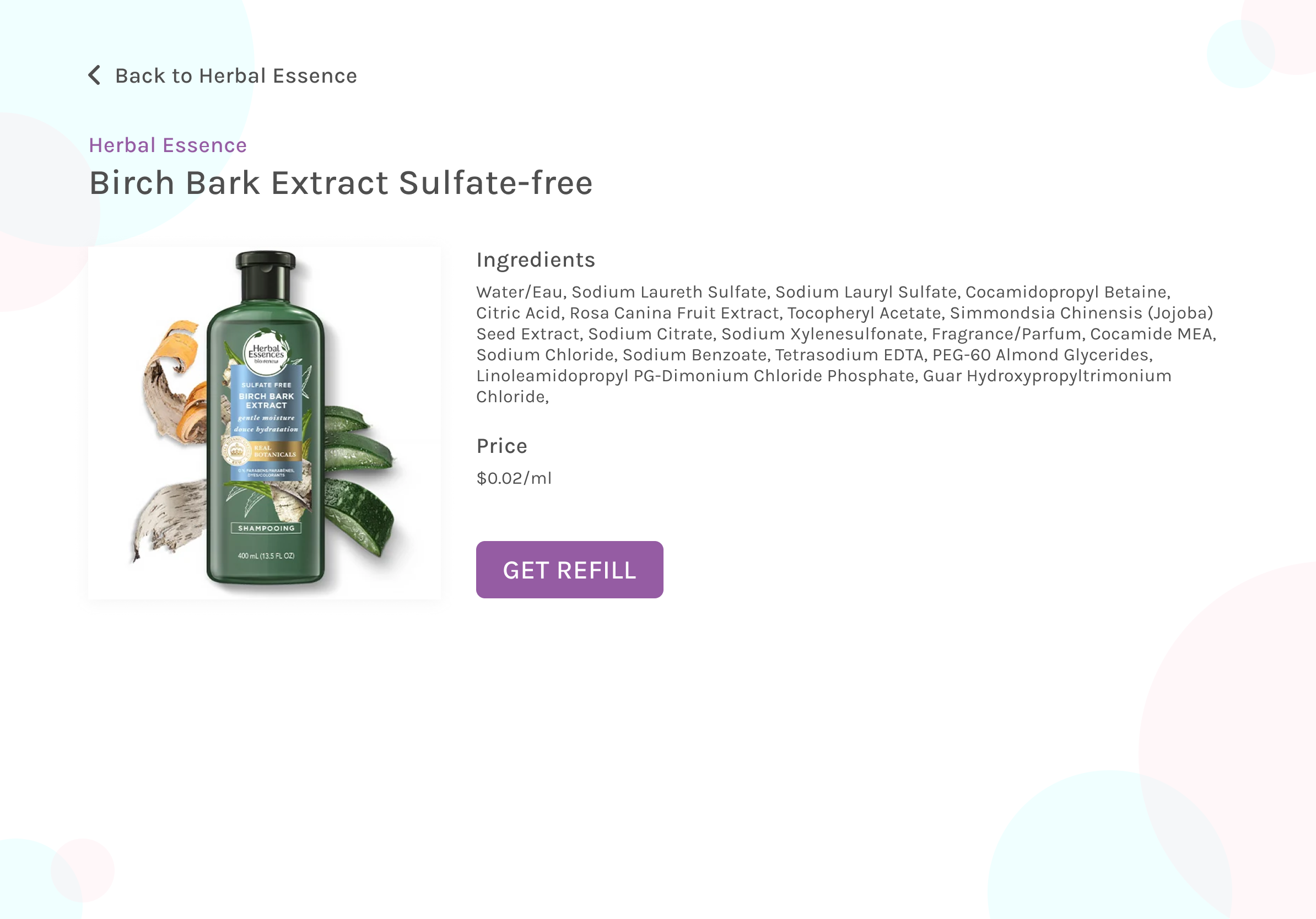
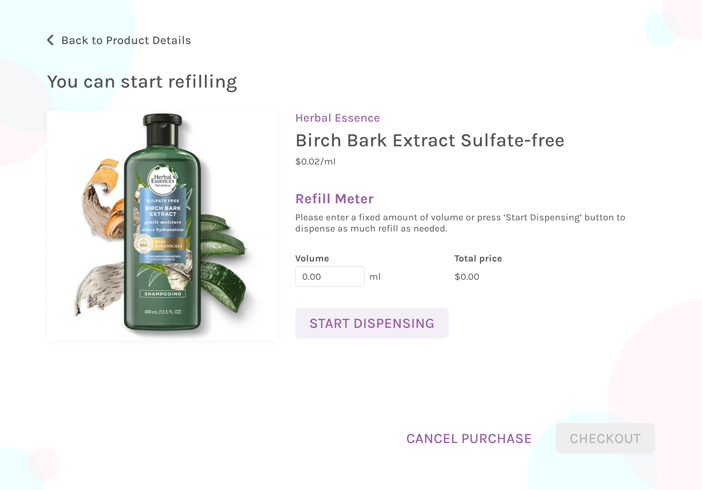
Mockups
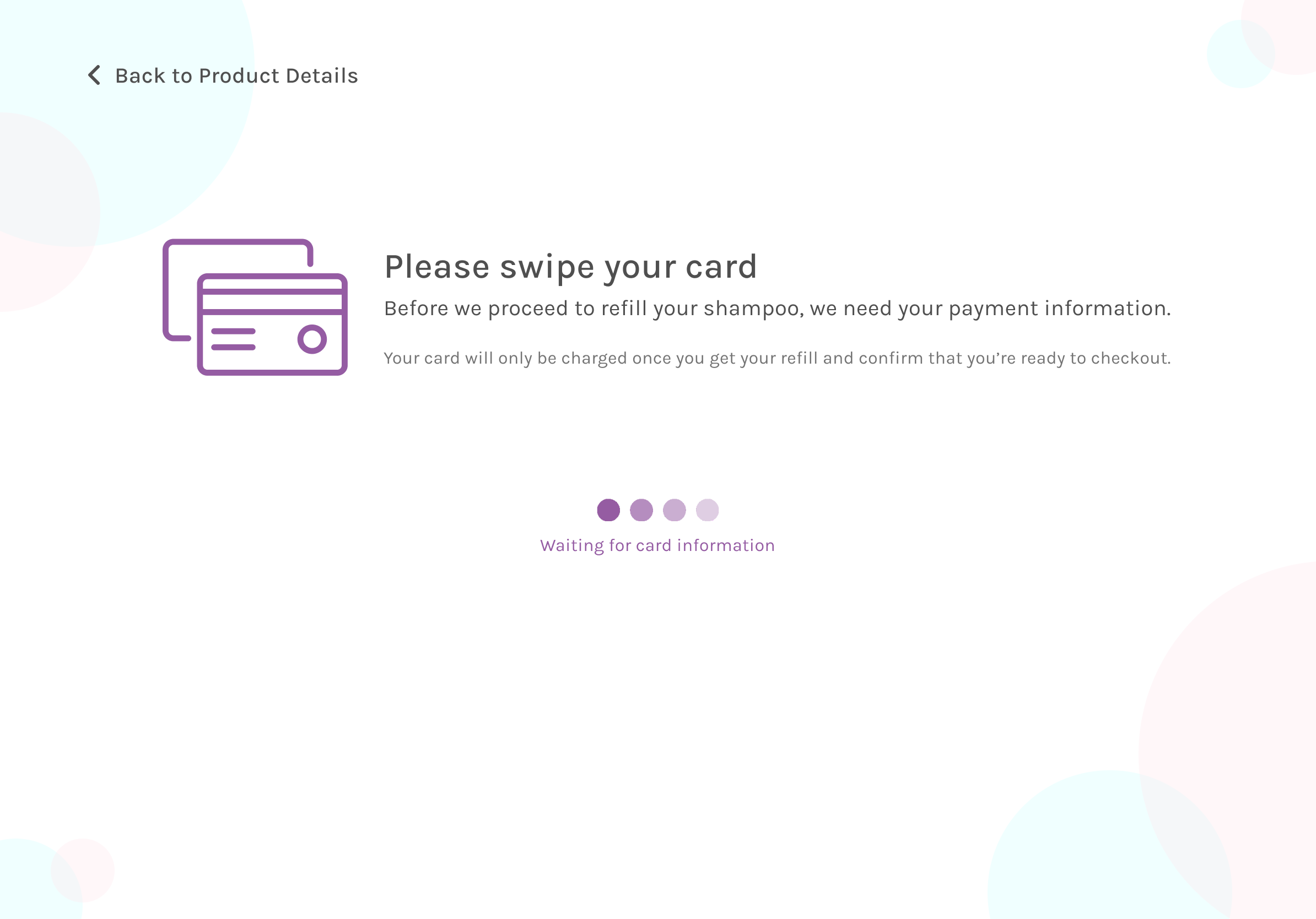
We created the hi-fi mockups on Figma. The final mockup reflects all of the adjustments we made based on the
feedback we got from our usability testing. One of the changes worth noting is that we switch the order of steps when users need to
swipe their card as a payment method. In our early wireframes, users could dispense their product before swiping their card for
payment. We realized this is a flaw from the business perspective as it depends heavily on honesty and trust — users can get away
without paying after getting their refill. That is why we adopt the vending machine system where the user needs to swipe their card
first — the system will save the payment method — then the user can dispense the shampoo they have selected.
Below are a couple of the final mockup screens. You can access the complete prototype
here.
Results and Takeaways
We are so proud of our final implementation of this project. Through this project, I have learned that great
design starts with the genuine intention to understand our users. Through user research and effort to truly understand our target
users, we can find the market gap that could differentiate our product from the other existing products on the market.
Another thing that I learned while working on this project is the importance of conducting usability testing in between steps.
At the very least, do one user testing using a lo-fi prototype and another with a hi-fi prototype before moving forward to
development. The goal is to check and recheck if we overlooked anything crucial and if the overall product is intuitive
for our users.